SHOW YOUR WORK – Essays from The Dublin Review
Designed by Oran Day, David Smith and Kayley Kemple at Atelier David Smith
Client: Brendan Barrington, The Dublin Review
Print & Production: Walsh Colour Print, Co. Kerry
Categories: Printed Publication / Editorial
Industry: Cultural
Tags: Typography
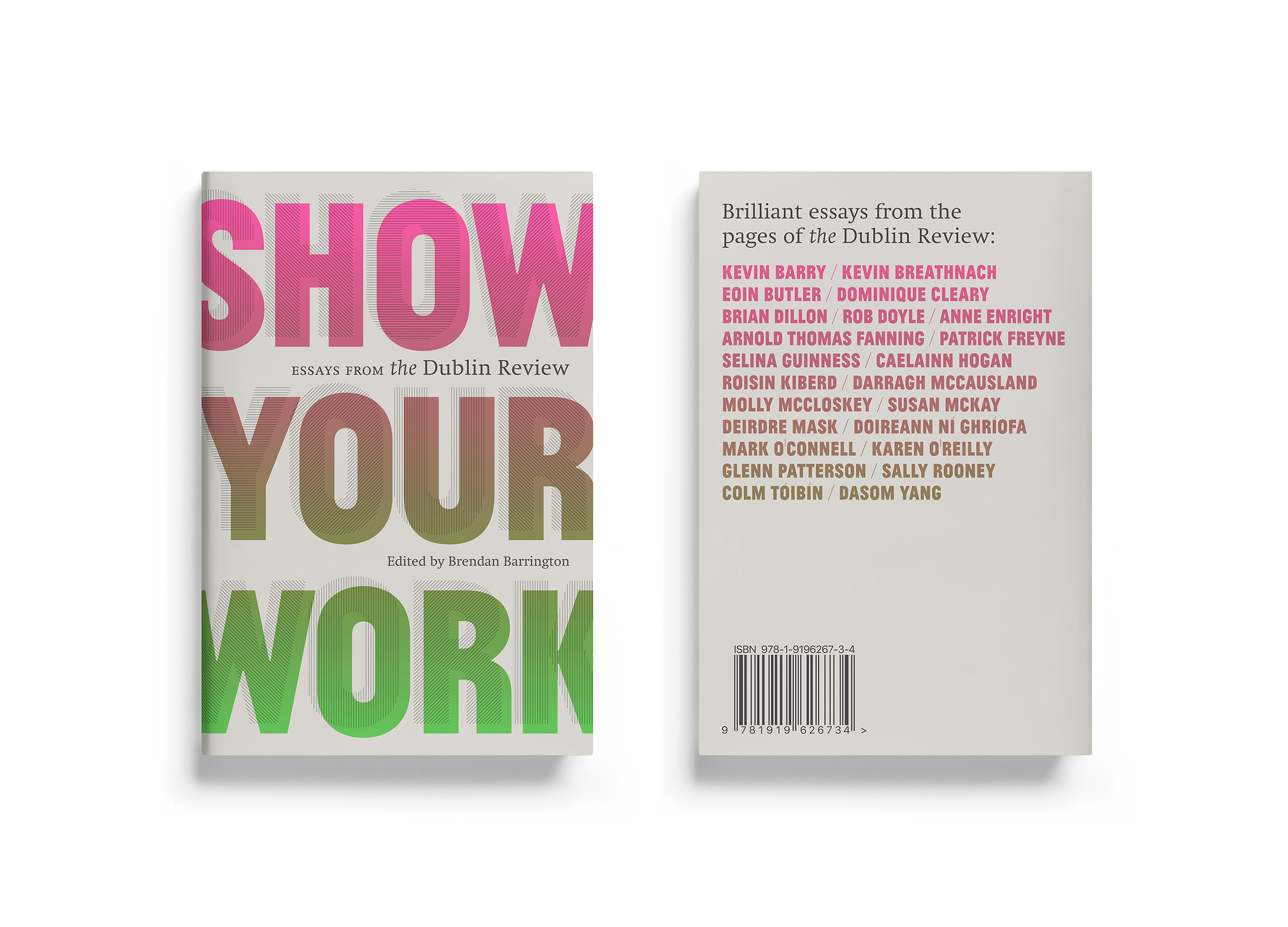
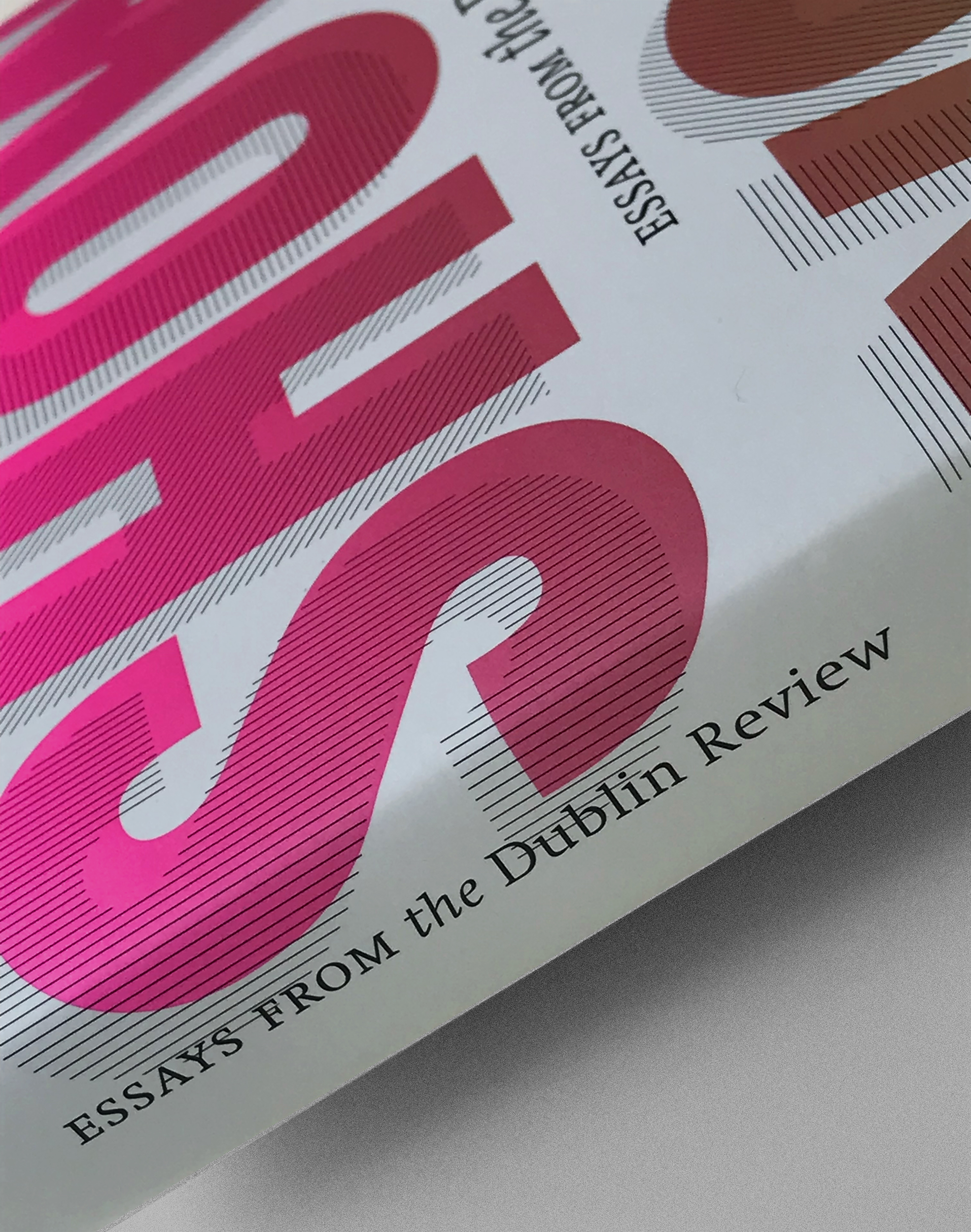
“At a time when the essay is flourishing like never before, The Dublin Review publishes an essential selection of non-fiction pieces drawn from fourteen years’ worth of issues.” The Dublin Review
Having worked with The Dublin Review since its inception in 2002, we were approached by founder and editor, Brendan Barrington to produce a striking and distinctive cover design for this second volume of collected essays.
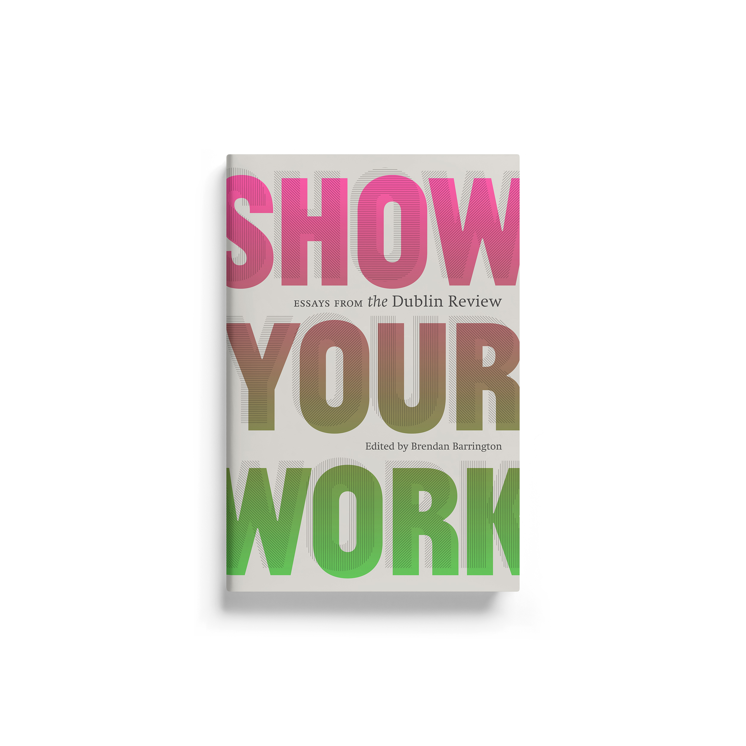
The cover design and interior typographic styles for The Dublin Review have always reflected the primacy of the written word, and it seemed obvious to us from the start that a typographic design would be the right direction.
The project commenced – before the COVID lockdowns in 2020 and 2021 – with a different working title. A broad range of purely typographic treatments were developed, but it was the ‘kinetic pop’ direction that most resonated with our client. Building on the classically inspired typography of The Dublin Review identity and journal, our client has increasingly sought to incorporate more contemporary and unapologetically ‘graphic’ visual styles for specific projects.
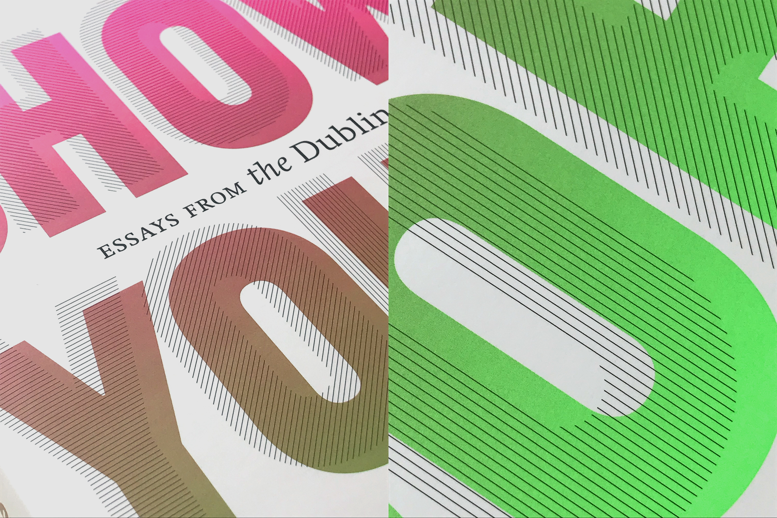
The complex and controlled interplay of custom (spot colour) gradients with bespoke mechanical/graphic screens (lines) had to be recreated from scratch for the final title, SHOW YOUR WORK. The vibrancy that results from the interaction of these graphic elements (gradients and lines) can be viewed as analogous to the revitalisation of the ‘essay’ as a literary form.
The robust letterforms/typeface (Jean-Luc by Atelier Carvalho Bernau) are believed to be based on an earlier stencil lettering device, the Plaque Découpée Universelle (circa 1870s). The utilitarian nature of the typeface seemed to correspond with the possible challenge (to SHOW YOUR WORK) implied by the title – these are all ‘serious’ writers, whose work is underscored by a pragmatic dedication to their craft.
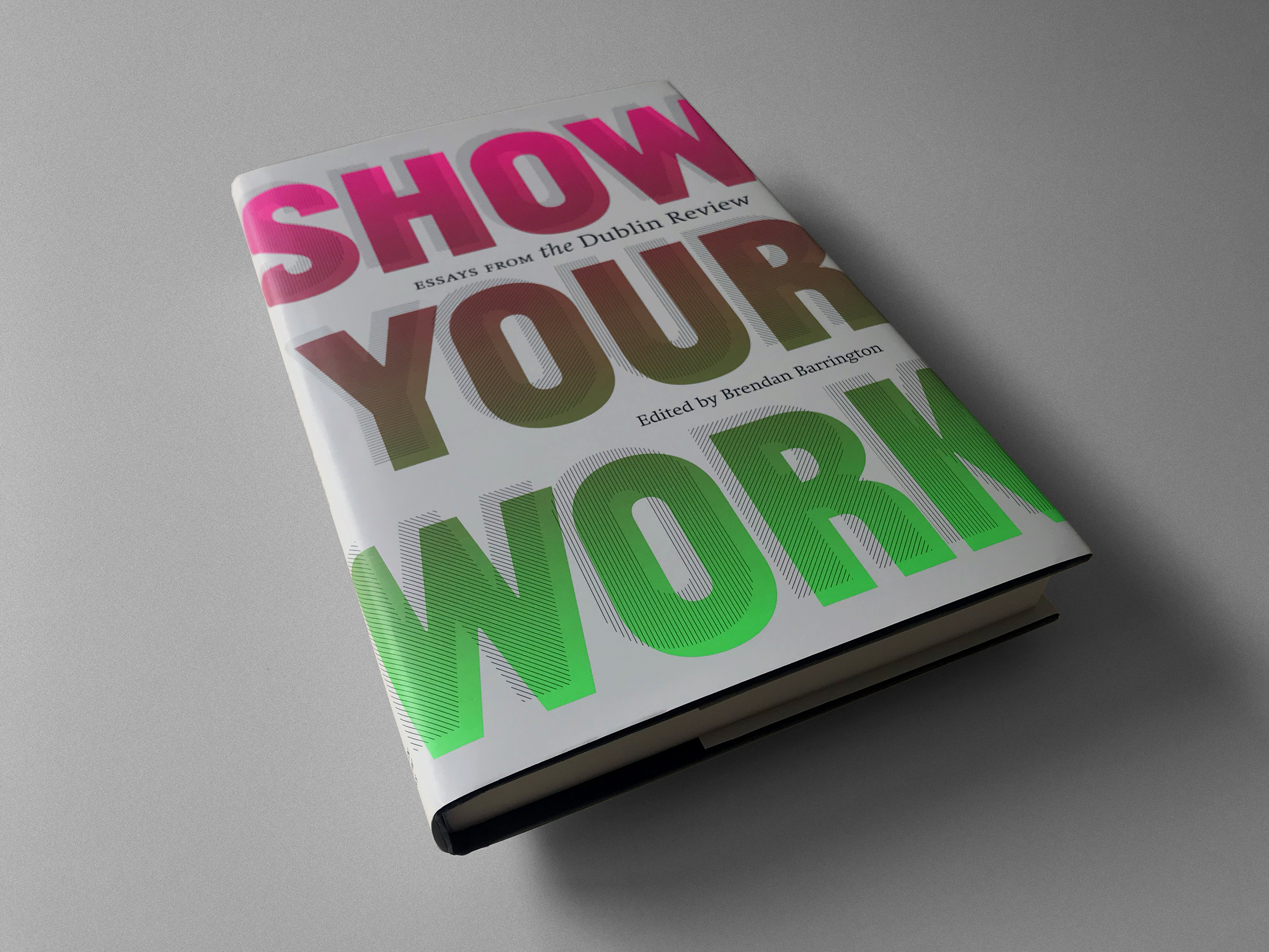
The Royal format (156 × 234mm) is a standard book size within the retail publishing industry. Our cover (dust-jacket) design is printed in four spot colours/inks – Black, light Grey and two fluorescent colours. While the final gradients are achieved using conventional halftone screens/dots, our familiarity with ‘split fount’ processes in lithographic and serigraphic printing enabled us to closely emulate the continuous tone gradients native to those processes.