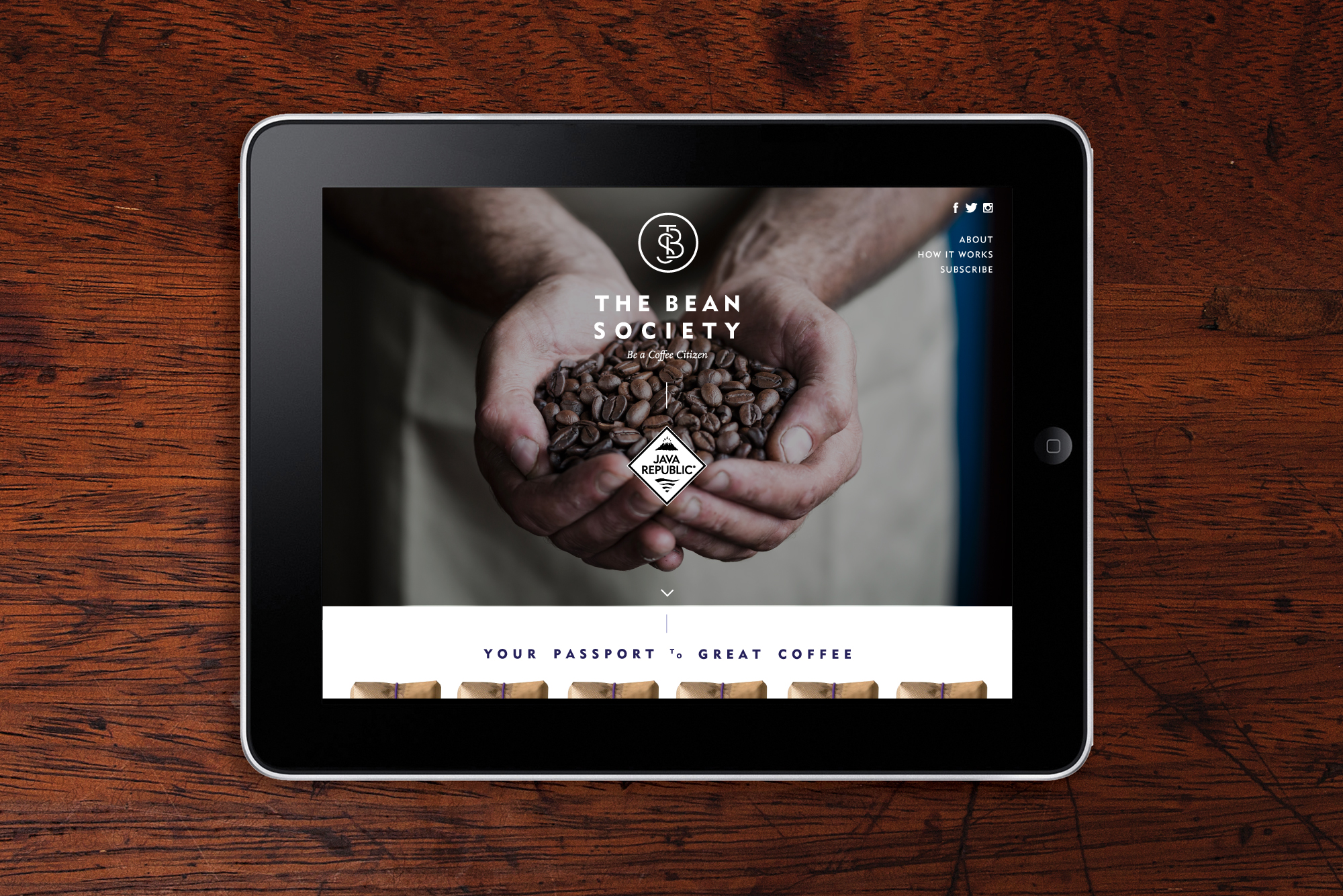
The Bean Society
Designed by Kathryn Wilson at Slater Design
Photography: Matthew Thompson
Categories: Identity / Packaging
Industry: Commercial
Mentioned in:
Website: thebeansociety.com
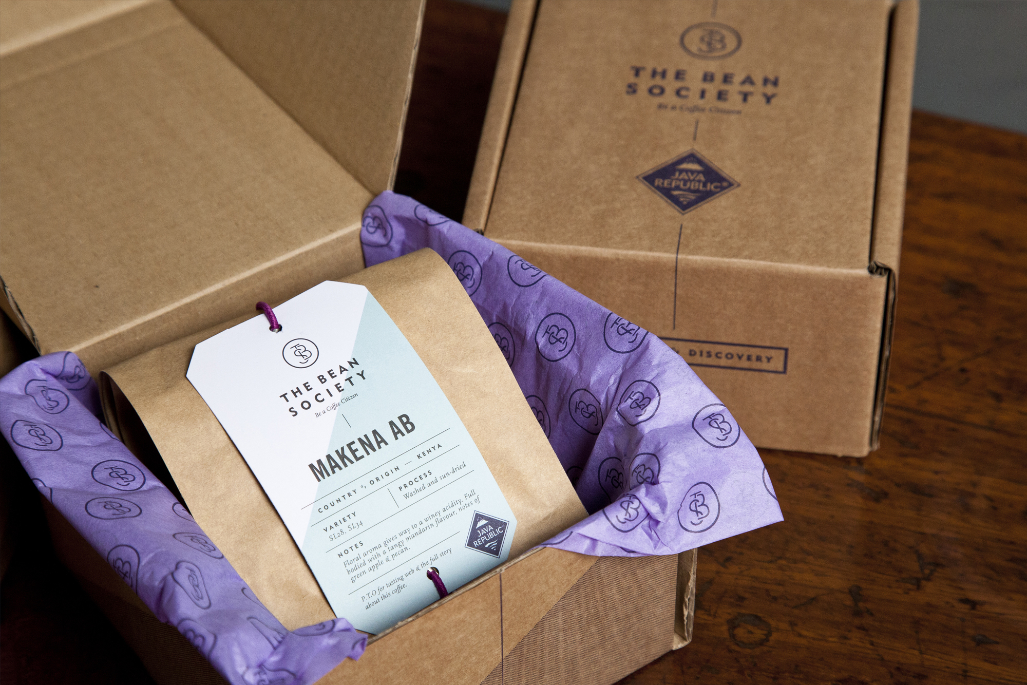
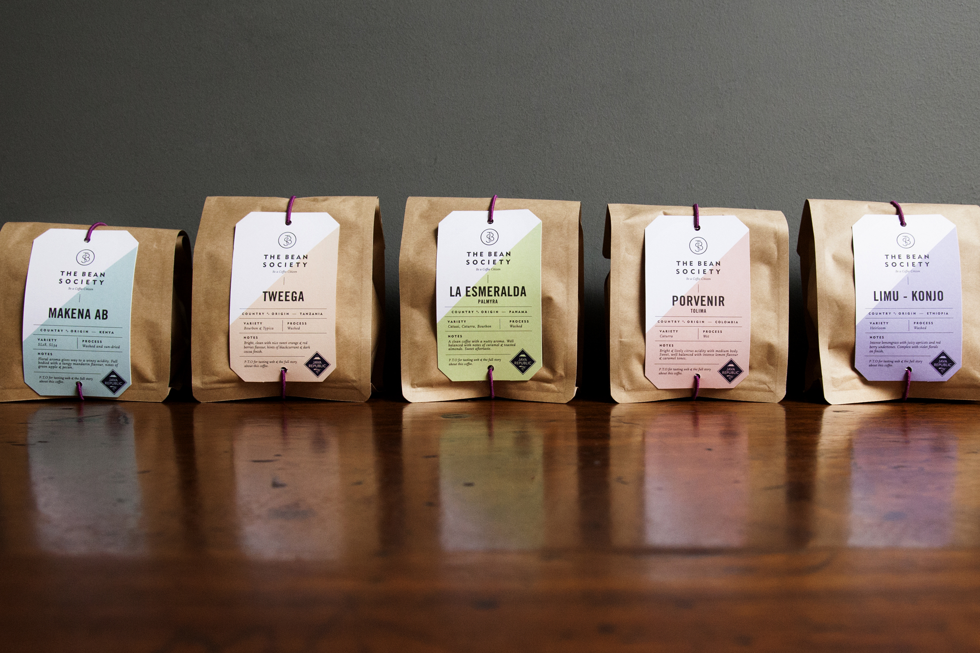
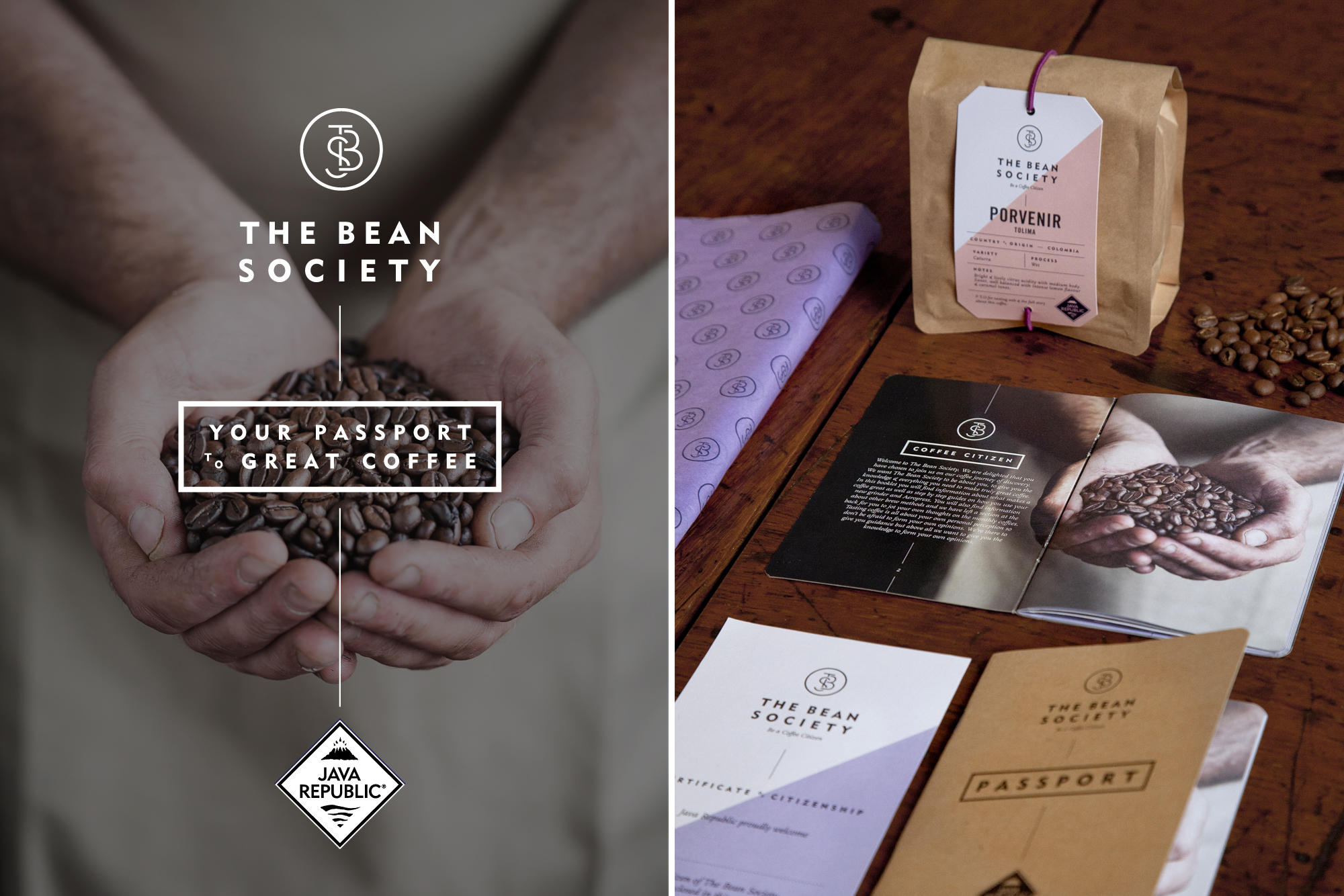
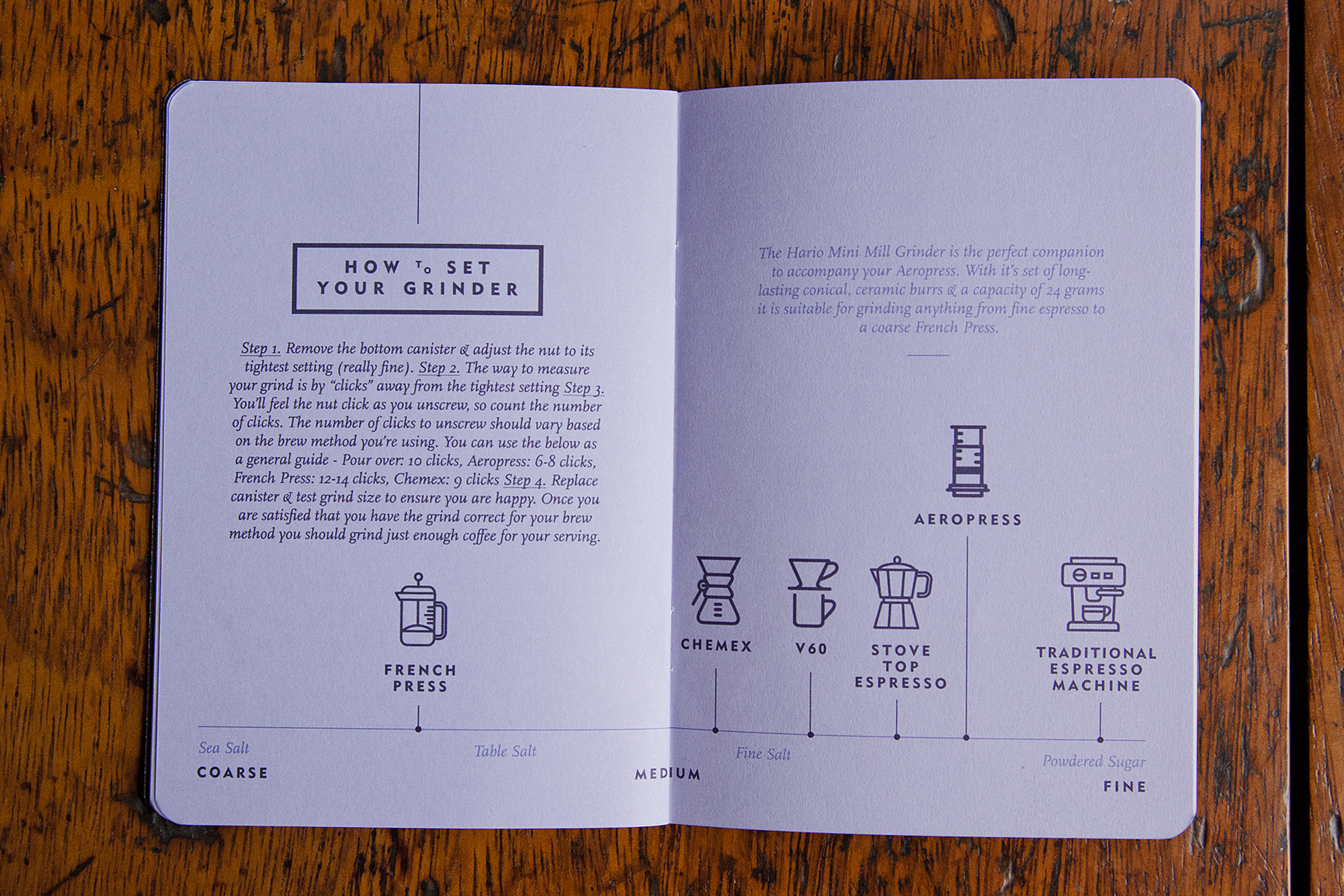
Java Republic asked us to design a brand and collateral for their new coffee subscription service called 'The Bean Society'. They briefed us that the new brand should have its own look and feel whilst still being recognisable as part of the Java Republic family.
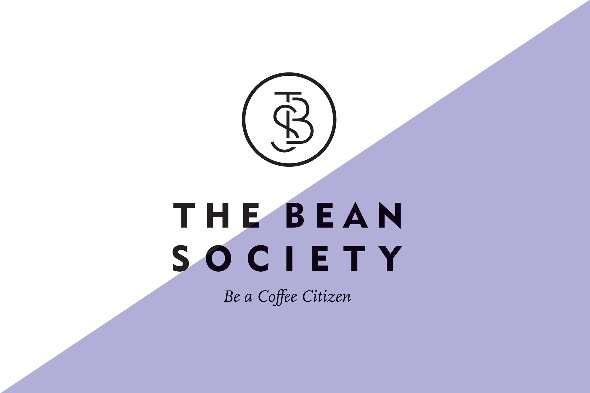
In order to achieve this we created a marque for The Bean Society and a design style that uses large diagonal shapes that echo the angles of the Java Republic logo. The font used is the Java Republic corporate font but used in such a way that gives The Bean Society its own distinctive style.