Starting off strong, our judges noted the high quality of the work submitted seeing "some exceptional examples of design and craftsmanship." Their appetite for selecting the 100 this year has been well and truly whetted with what they saw as a "promising start" for the next Archive Selection.
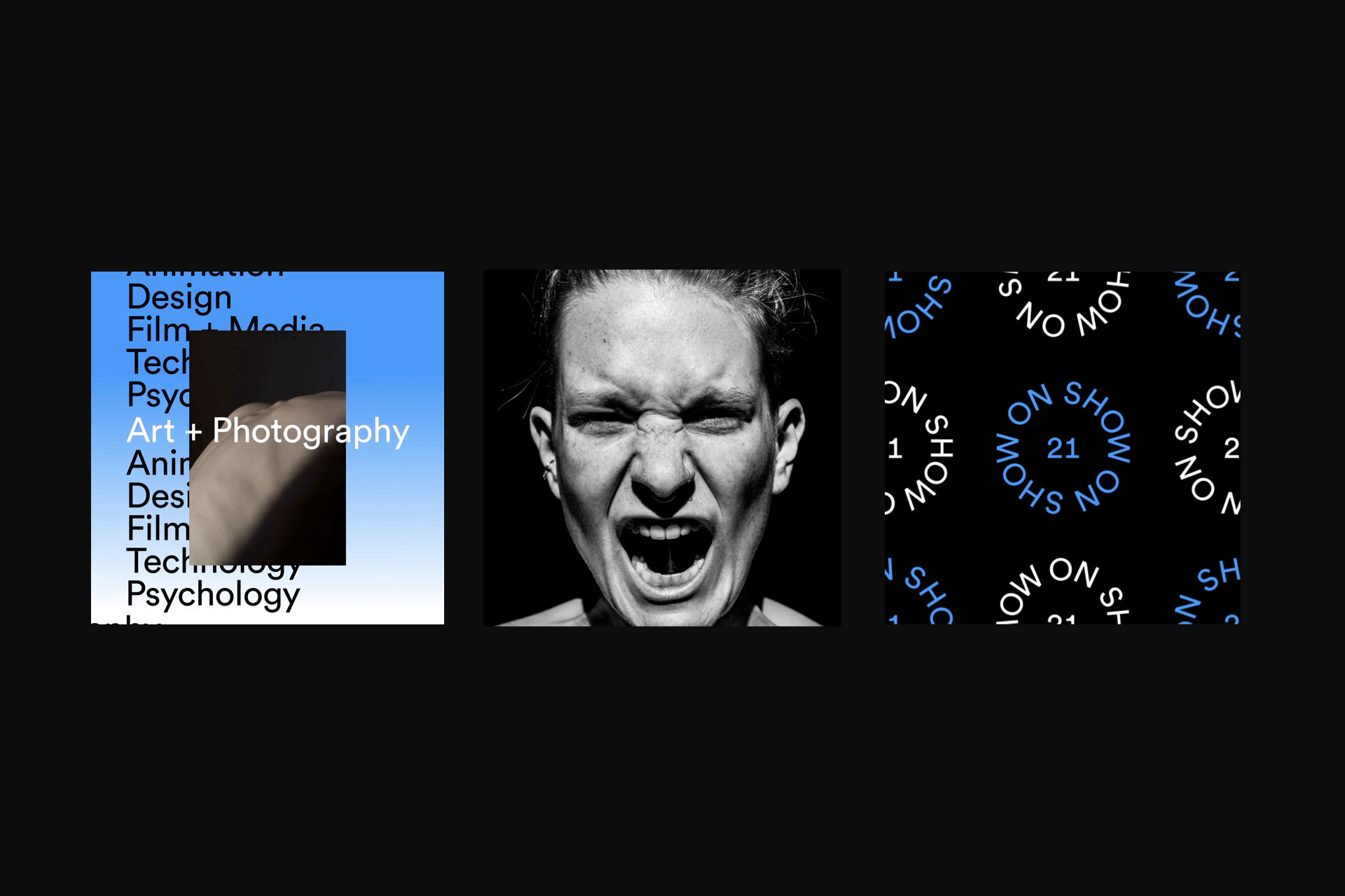
Typographic excellence and expression made a bold showing in this glut of projects, with one of our judges noticing a connecting thread in the way typography has been used to convey emotion, heritage and hierarchy. "Typefaces are treated as more than tools in some instances - they’re opportunities for play and experimentation." Another commented: " It is interesting to see the thoughtfulness of submissions such as the use of a typeface by local designer Signal Type in Foundations of the Future." The identity for IADT's On Show [above] received kudos for being an example of how simplicity of design and typography can allow the work being showcased to truly shine. "This is a tricky consideration to get right as sometimes an overarching identity can overshadow the work that’s on show. In this instance, the circular type animations help to create the context for the work and bring it to another level." Another project to get special mention was The Visible Universe, which was judged "a visual feast of imagery and typography."
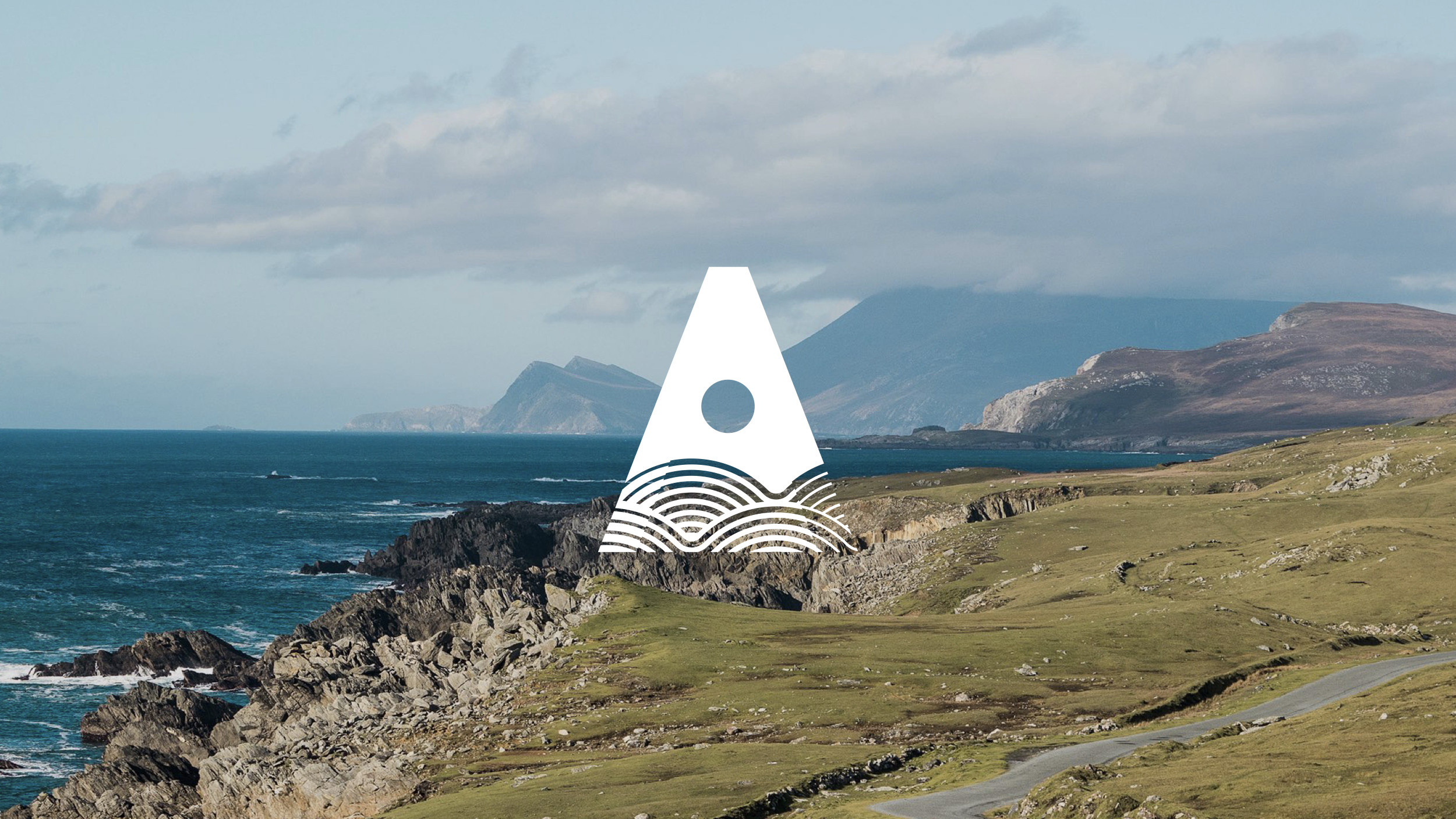
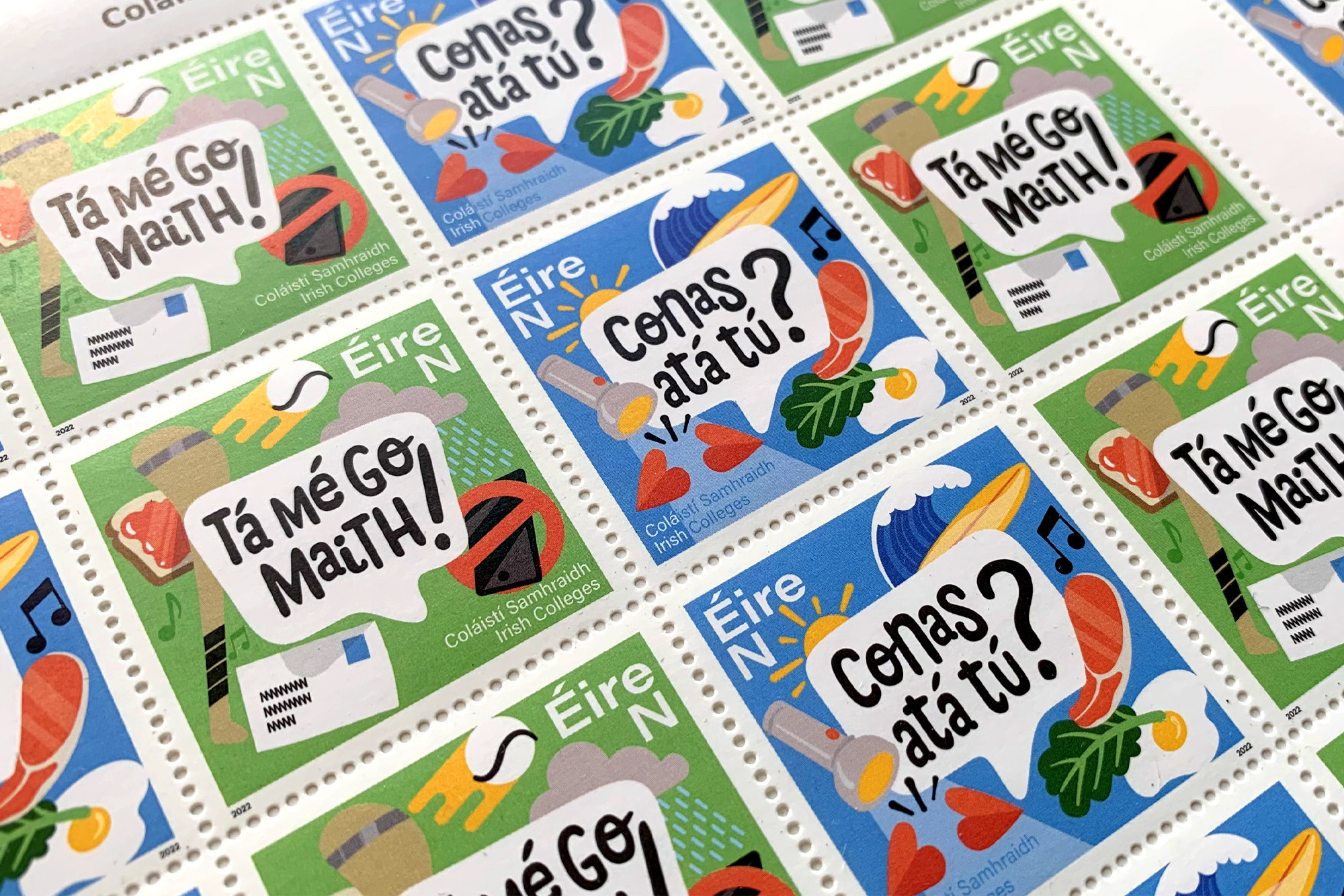
A strong theme to emerge from the summer submissions was a distinctly Irish character, demonstrating a stage of maturity in Irish design whereby we are looking inwards for inspiration and showing the world what we're made of. As one reviewer captured it: "It's heartening to see Irish heritage being embraced in some of the work. This helps create a unique cultural aesthetic which we should, as a collective body of Irish designers, be aiming to claim as our own." One such example is the "very unique" Atlantic TU [above] identity which was seen as "a wonderfully cohesive and flexible solution that, through the A graphic device and overall system, captures the spirit of the region and embraces Irish design and culture in a thoughtful way." A similar nod to heritage comes from the place-brand identity for Glass Bottle on which the judges remarked: "From the beautifully crafted logotype to the colours and details, like tidal and wave data, this sense of heritage makes for a much more rounded and authentic place brand that the Glass Bottle community can take ownership of." A playful take on the heritage theme came from the stamp designs for Coláistí Samhraidh [banner image] which received the following comment: "From the playful illustrations to the hand-drawn type and as Gaeilge language, the detail in these stamps endearingly remind us of everything around the Gaeltacht experience. Fitting it all on such a small item as a stamp is no small feat and is down to the skill of the designers to get it absolutely right."
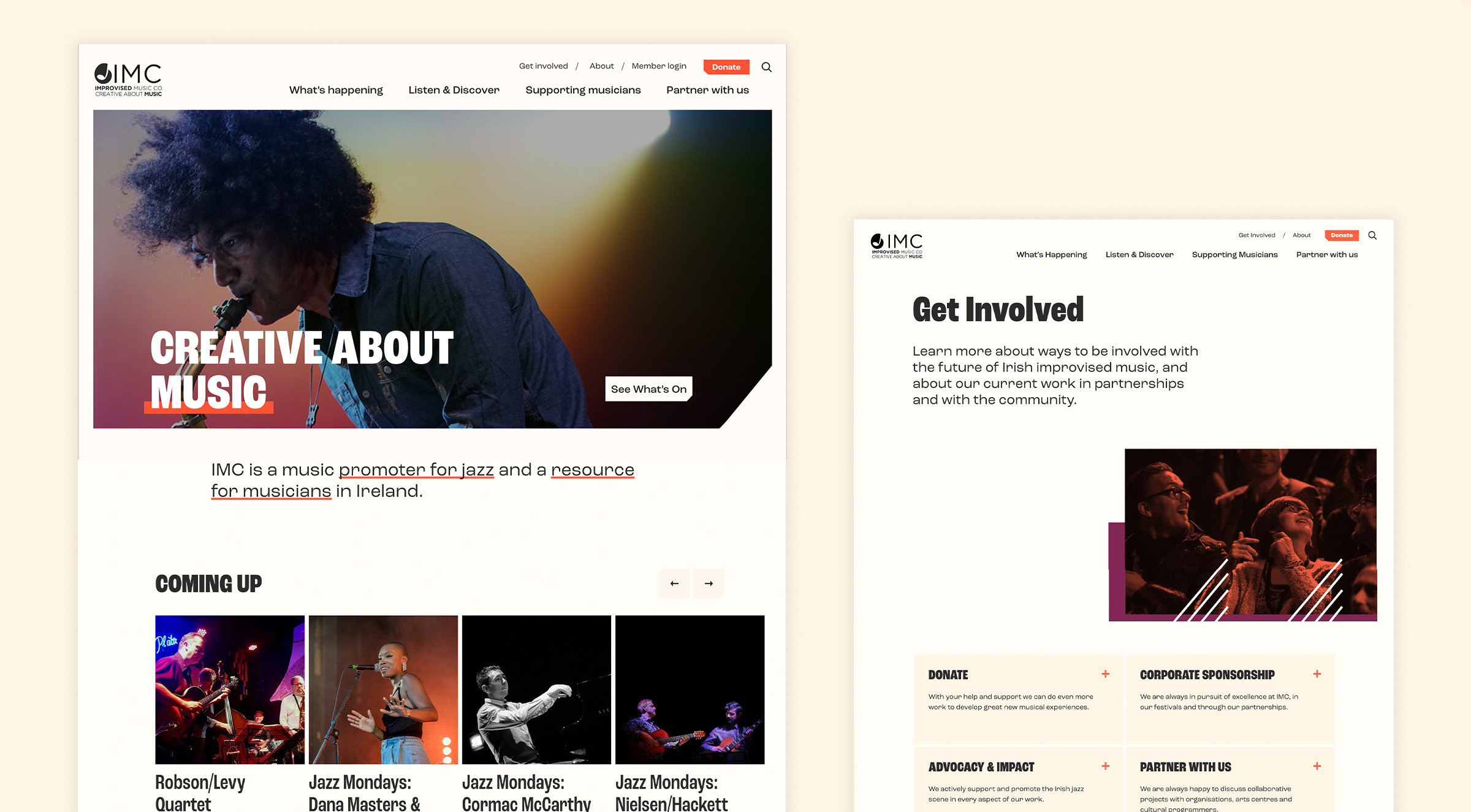
Sustainable solutions featured too, with Improvised Music Company's [above]sustainable website design and interaction getting special mention: "It's interesting to note the reduction of the "carbon impact of the website" as one of the key features of this project. The fluid movement of acts and announcements on the home page is impressive."
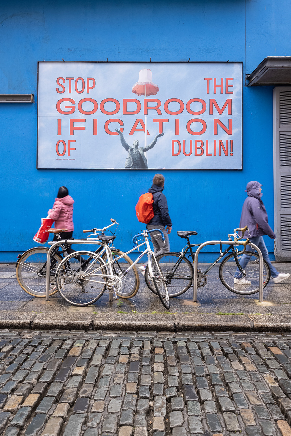
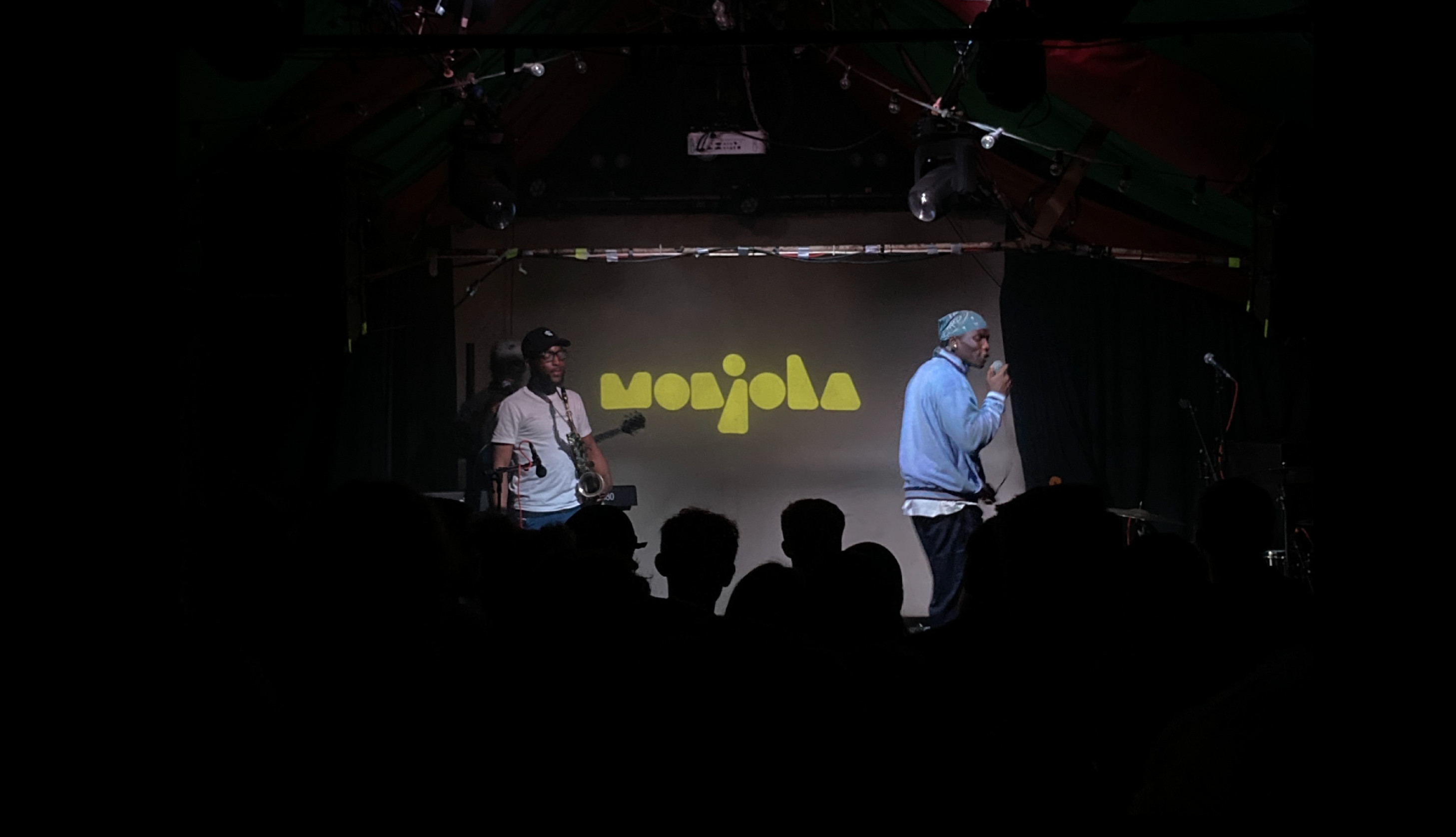
Something the judges really picked up on in this bunch of projects was a spark of liveliness and fun, maybe reflecting the desire to be a little less serious in the aftermath (or rather, 'the -math' - as 2002 offers little respite from the news) of the doom times. Highlights here came from the Size It, Bag It, Separate it campaign "This is fun messaging for a painfully stressful pinch point in an airport... disarming with charm"; Stop The Good Roomification campaign [above] was seen as an engaging approach to a serious topic: "Coining a clever slogan, the Good Roomification execution is striking and playful. A 'stop you in your tracks and make you think' interjection". Monjola got kudos for its soft and shapely logo design: "It's wonderful to see the music industry embracing logotypes as a consideration for assets and staging. This chunky and slouchy type of font is redolent of a streetwear brand." The Centre Culturel Irlandais website design was also recognised for it's levity while prioritising the user experience: "This clean, yet playful, design enables quick engagement with the scale of offerings from CCI. A fresh contemporary reboot with clean navigation which engages on multiple levels."
So a lot to delight and inspire in the summer submissions. Thanks again to all who took part and please keep submitting the work you're most proud of from 2022 as it finishes up, we love to see it and it lifts the whole community to see what Irish Design can be and the impact it can have at home and beyond!